Hey everyone! 👋
Today, we’re going to whip up a super cute “I Love You” animation using HTML, CSS, and JavaScript. This Valentine-style animation is perfect for beginners who want to learn something fun, as well as for experienced developers looking for a quick and creative project.
The best part?
We’ll keep everything easy and breezy:
- 🧱 HTML for structure
- 🎨 CSS for styling
- ✨ JavaScript (with mo.js) for smooth, playful animations
No heavy frameworks, no complex setup just pure front-end fun. Let’s jump right in and spread some love through code ❤️
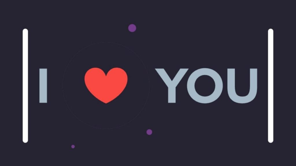
🌟 What We’re Building
This project animates the text “I LOVE YOU” using:
- SVG paths for letters
- Animated lines and heart shapes
- Burst effects and easing animations
- Optional sound effects with a toggle
The animation loops continuously, making it perfect for:
- Valentine’s Day pages 💌
- Romantic surprise websites
- Creative animation demos
- Learning SVG + animation libraries
🧱 HTML Structure
The HTML sets up:
- An SVG containing each letter as a path
- A container for mo.js animations
- Audio elements for sound effects
- A toggle button to turn sound on/off
<!DOCTYPE html>
<html lang="en">
<head>
  <meta charset="UTF-8">
  <title>I Love You Animation | Coding Stella</title>
  <link rel="stylesheet" href="./style.css">
</head>
<body>

<div class="container">
  <svg class="svg-container" viewBox="0 0 500 200">
    <line class="line line--left" x1="10" y1="17" x2="10" y2="183"></line>
    <line class="line line--rght" x1="490" y1="17" x2="490" y2="183"></line>

    <g>
      <path class="lttr lttr--I" d="M42.2,73.9h11.4v52.1H42.2V73.9z"></path>
      <path class="lttr lttr--L" d="M85.1,73.9h11.4v42.1h22.8v10H85.1V73.9z"></path>
      <path class="lttr lttr--O" d="M123.9,100c0-15.2,11.7-26.9,27.2-26.9s27.2,11.7,27.2,26.9s-11.7,26.9-27.2,26.9S123.9,115.2,123.9,100z"></path>
      <path class="lttr lttr--V" d="M180.7,73.9H193l19.9,52.1h-11.5L180.7,73.9z"></path>
      <path class="lttr lttr--E" d="M239.1,73.9h32.2v10h-20.7v10.2h17.9v9.5h-17.9v12.4H272v10h-33V73.9z"></path>
      <path class="lttr lttr--Y" d="M315.8,102.5l-20.1-28.6H309l12.7,19h0.1l12.6-19h12.9l-19.9,28.5v23.6h-11.4V102.5z"></path>
      <path class="lttr lttr--O2" d="M348.8,100c0-15.2,11.7-26.9,27.2-26.9s27.2,11.7,27.2,26.9s-11.7,26.9-27.2,26.9S348.8,115.2,348.8,100z"></path>
      <path class="lttr lttr--U" d="M412.4,101.1V73.9h11.4v26.7c0,10.9,2.4,15.9,11.5,15.9s11.4-4.6,11.4-15.8V73.9h11v26.9c0,16.9-8.7,26.1-24,26.1s-24.3-9.2-24.3-25.8z"></path>
    </g>
  </svg>

  <div class="mo-container"></div>
</div>

<audio class="blup">
  <source src="https://www.freesound.org/data/previews/265/265115_4373976-lq.mp3">
</audio>
<audio class="blop">
  <source src="https://www.freesound.org/data/previews/265/265115_4373976-lq.mp3">
</audio>

<div class="sound">sound</div>

<script src="https://cdn.jsdelivr.net/mojs/latest/mo.min.js"></script>
<script src="./script.js"></script>
</body>
</html>
🎨 CSS Styling
The CSS:
- Centers everything perfectly
- Uses a dark background for contrast
- Styles SVG letters and lines
- Adds a responsive layout
- Provides a sound toggle indicator
*,
*:before,
*:after {
  box-sizing: border-box;
  margin: 0;
  padding: 0;
}

html,
body {
  min-height: 100vh;
  display: flex;
  justify-content: center;
  align-items: center;
  background-color: #282a36;
  font-size: 62.5%;
  font-family: "Helvetica Neue", Helvetica, Arial, sans-serif;
}
@media screen and (max-width: 520px) {
  html,
body {
    /* don't know how to set default units to rem in mojs :(( */
  }
}

.container {
  width: 50rem;
  height: 20rem;
  position: relative;
}

.svg-container {
  z-index: 2;
  position: absolute;
}

.mo-container {
  width: 100%;
  height: 100%;
}

.line {
  fill: none;
  stroke: #ffffff;
  stroke-width: 8;
  stroke-linecap: round;
  stroke-miterlimit: 10;
}

.lttr {
  fill: #a5b9c7;
}

.sound {
  position: fixed;
  color: #a5b9c7;
  font-size: 1.6rem;
  bottom: 1rem;
  right: 1rem;
  text-decoration: underline;
  cursor: default;
}
.sound--off {
  text-decoration: line-through;
}
✨ JavaScript Animation Logic
The JavaScript is where the magic happens:
- Uses mo.js for timeline-based animations
- Animates letters individually
- Adds heart shapes and burst effects
- Controls sound effects
- Replays animation every few seconds
💡 This script handles all motion, easing, bursts, heart scaling, and sound toggling.
const qs = document.querySelector.bind(document);
const easingHeart = mojs.easing.path(
"M0,100C2.9,86.7,33.6-7.3,46-7.3s15.2,22.7,26,22.7S89,0,100,0");


const el = {
  container: qs(".mo-container"),

  i: qs(".lttr--I"),
  l: qs(".lttr--L"),
  o: qs(".lttr--O"),
  v: qs(".lttr--V"),
  e: qs(".lttr--E"),
  y: qs(".lttr--Y"),
  o2: qs(".lttr--O2"),
  u: qs(".lttr--U"),

  lineLeft: qs(".line--left"),
  lineRight: qs(".line--rght"),

  colTxt: "#763c8c",
  colHeart: "#fa4843",

  blup: qs(".blup"),
  blop: qs(".blop"),
  sound: qs(".sound") };


class Heart extends mojs.CustomShape {
  getShape() {
    return '';
  }
  getLength() {
    return 200;
  }}

mojs.addShape("heart", Heart);

const crtBoom = (delay = 0, x = 0, rd = 46) => {
  parent = el.container;
  const crcl = new mojs.Shape({
    shape: "circle",
    fill: "none",
    stroke: el.colTxt,
    strokeWidth: { 5: 0 },
    radius: { [rd]: [rd + 20] },
    easing: "quint.out",
    duration: 500 / 3,
    parent,
    delay,
    x });


  const brst = new mojs.Burst({
    radius: { [rd + 15]: 110 },
    angle: "rand(60, 180)",
    count: 3,
    timeline: { delay },
    parent,
    x,
    children: {
      radius: [5, 3, 7],
      fill: el.colTxt,
      scale: { 1: 0, easing: "quad.in" },
      pathScale: [0.8, null],
      degreeShift: ["rand(13, 60)", null],
      duration: 1000 / 3,
      easing: "quint.out" } });


  return [crcl, brst];
};

const crtLoveTl = () => {
  const move = 1000;
  const boom = 200;
  const easing = "sin.inOut";
  const easingBoom = "sin.in";
  const easingOut = "sin.out";
  const opts = { duration: move, easing, opacity: 1 };
  const delta = 150;

  return new mojs.Timeline().add([
  new mojs.Tween({
    duration: move,
    onStart: () => {
      [el.i, el.l, el.o, el.v, el.e, el.y, el.o2, el.u].forEach(el => {
        el.style.opacity = 1;
        el.style =
        "transform: translate(0px, 0px) rotate(0deg) skew(0deg, 0deg) scale(1, 1); opacity: 1;";
      });
    },
    onComplete: () => {
      [el.l, el.o, el.v, el.e].forEach(el => el.style.opacity = 0);
      el.blop.play();
    } }),


  new mojs.Tween({
    duration: move * 2 + boom,
    onComplete: () => {
      [el.y, el.o2].forEach(el => el.style.opacity = 0);
      el.blop.play();
    } }),


  new mojs.Tween({
    duration: move * 3 + boom * 2 - delta,
    onComplete: () => {
      el.i.style.opacity = 0;
      el.blop.play();
    } }),


  new mojs.Tween({
    duration: move * 3 + boom * 2,
    onComplete: () => {
      el.u.style.opacity = 0;
      el.blup.play();
    } }),


  new mojs.Tween({
    duration: 50,
    delay: 4050,
    onUpdate: progress => {
      [el.i, el.l, el.o, el.v, el.e, el.y, el.o2, el.u].forEach(el => {
        el.style = `transform: translate(0px, 0px) rotate(0deg) skew(0deg, 0deg) scale(1, 1); opacity: ${
        1 * progress
        };`;
      });
    },
    onComplete: () => {
      [el.i, el.l, el.o, el.v, el.e, el.y, el.o2, el.u].forEach(el => {
        el.style.opacity = 1;
        el.style =
        "transform: translate(0px, 0px) rotate(0deg) skew(0deg, 0deg) scale(1, 1); opacity: 1;";
      });
    } }),


  new mojs.Html({
    ...opts,
    el: el.lineLeft,
    x: { 0: 52 } }).

  then({
    duration: boom + move,
    easing,
    x: { to: 52 + 54 } }).

  then({
    duration: boom + move,
    easing,
    x: { to: 52 + 54 + 60 } }).

  then({
    duration: 150, // 3550
    easing,
    x: { to: 52 + 54 + 60 + 10 } }).

  then({
    duration: 300 }).

  then({
    duration: 350,
    x: { to: 0 },
    easing: easingOut }),


  new mojs.Html({
    ...opts,
    el: el.lineRight,
    x: { 0: -52 } }).

  then({
    duration: boom + move,
    easing,
    x: { to: -52 - 54 } }).

  then({
    duration: boom + move,
    easing,
    x: { to: -52 - 54 - 60 } }).

  then({
    duration: 150,
    easing,
    x: { to: -52 - 54 - 60 - 10 } }).

  then({
    duration: 300 }).

  then({
    duration: 350,
    x: { to: 0 },
    easing: easingOut }),


  new mojs.Html({
    // [I] LOVE YOU
    ...opts,
    el: el.i,
    x: { 0: 34 } }).

  then({
    duration: boom,
    easing: easingBoom,
    x: { to: 34 + 19 } }).

  then({
    duration: move,
    easing,
    x: { to: 34 + 19 + 40 } }).

  then({
    duration: boom,
    easing: easingBoom,
    x: { to: 34 + 19 + 40 + 30 } }).

  then({
    duration: move,
    easing,
    x: { to: 34 + 19 + 40 + 30 + 30 } }),


  new mojs.Html({
    // I [L]OVE YOU
    ...opts,
    el: el.l,
    x: { 0: 15 } }),


  new mojs.Html({
    // I L[O]VE YOU
    ...opts,
    el: el.o,
    x: { 0: 11 } }),


  new mojs.Html({
    // I LO[V]E YOU
    ...opts,
    el: el.v,
    x: { 0: 3 } }),


  new mojs.Html({
    // I LOV[E] YOU
    ...opts,
    el: el.e,
    x: { 0: -3 } }),


  new mojs.Html({
    // I LOVE [Y]OU
    ...opts,
    el: el.y,
    x: { 0: -20 } }).

  then({
    duration: boom,
    easing: easingBoom,
    x: { to: -20 - 33 } }).

  then({
    duration: move,
    easing,
    x: { to: -20 - 33 - 24 } }),


  new mojs.Html({
    // I LOVE Y[O]U
    ...opts,
    el: el.o2,
    x: { 0: -27 } }).

  then({
    duration: boom,
    easing: easingBoom,
    x: { to: -27 - 27 } }).

  then({
    duration: move,
    easing,
    x: { to: -27 - 27 - 30 } }),


  new mojs.Html({
    // I LOVE YO[U]
    ...opts,
    el: el.u,
    x: { 0: -32 } }).

  then({
    duration: boom,
    easing: easingBoom,
    x: { to: -32 - 21 } }).

  then({
    duration: move,
    easing,
    x: { to: -32 - 21 - 36 } }).

  then({
    duration: boom,
    easing: easingBoom,
    x: { to: -32 - 21 - 36 - 31 } }).

  then({
    duration: move,
    easing,
    x: { to: -32 - 21 - 36 - 31 - 27 } }),


  new mojs.Shape({
    parent: el.container,
    shape: "heart",
    delay: move,
    fill: el.colHeart,
    x: -64,
    scale: { 0: 0.95, easing: easingHeart },
    duration: 500 }).

  then({
    x: { to: -62, easing },
    scale: { to: 0.65, easing },
    duration: boom + move - 500 }).

  then({
    duration: boom - 50,
    x: { to: -62 + 48 },
    scale: { to: 0.9 },
    easing: easingBoom }).

  then({
    duration: 125,
    scale: { to: 0.8 },
    easing: easingOut }).

  then({
    duration: 125,
    scale: { to: 0.85 },
    easing: easingOut }).

  then({
    duration: move - 200,
    scale: { to: 0.45 },
    easing }).

  then({
    delay: -75,
    duration: 150,
    x: { to: 0 },
    scale: { to: 0.9 },
    easing: easingBoom }).

  then({
    duration: 125,
    scale: { to: 0.8 },
    easing: easingOut }).

  then({
    duration: 125, // 3725
    scale: { to: 0.85 },
    easing: easingOut }).

  then({
    duration: 125 // 3850
  }).
  then({
    duration: 350,
    scale: { to: 0 },
    easing: easingOut }),


  ...crtBoom(move, -64, 46),
  ...crtBoom(move * 2 + boom, 18, 34),
  ...crtBoom(move * 3 + boom * 2 - delta, -64, 34),
  ...crtBoom(move * 3 + boom * 2, 45, 34)]);

};

const loveTl = crtLoveTl().play();
setInterval(() => {
  loveTl.replay();
}, 4300);

const volume = 0.2;
el.blup.volume = volume;
el.blop.volume = volume;

const toggleSound = () => {
  let on = true;
  return () => {
    if (on) {
      el.blup.volume = 0.0;
      el.blop.volume = 0.0;
      el.sound.classList.add("sound--off");
    } else {
      el.blup.volume = volume;
      el.blop.volume = volume;
      el.sound.classList.remove("sound--off");
    }
    on = !on;
  };
};
el.sound.addEventListener("click", toggleSound());
❤️ Final Thoughts
Creating this “I Love You” animation has been a fun and rewarding experience. With just HTML, CSS, and JavaScript, we’ve built something that’s:
- Visually engaging
- Emotionally expressive
- Technically educational
Whether you’re a beginner exploring animations or a seasoned developer adding flair to your portfolio, this project is a sweet little win 🍬