Build a Modern Glassmorphism Login Form Using HTML & CSS
Hey folks 👋 Today’s coding session is all about simplicity, style, and modern UI design.
We’re going to create a modern login form using HTML and CSS, enhanced with the trendy
Glassmorphism effect.
This blog post will guide you step by step through crafting a sleek, elegant, and responsive login form
that follows today’s UI/UX trends. Whether you’re a seasoned developer or just starting your web
development journey, this tutorial is a quick, fun, and rewarding way to level up your frontend skills.
So let’s keep things simple and jump straight into the code. Join me in this creative coding adventure,
and let’s build a stylish login form that effortlessly blends form and function.
Ready to give your web projects a fresh, modern look? Let’s get started 🚀
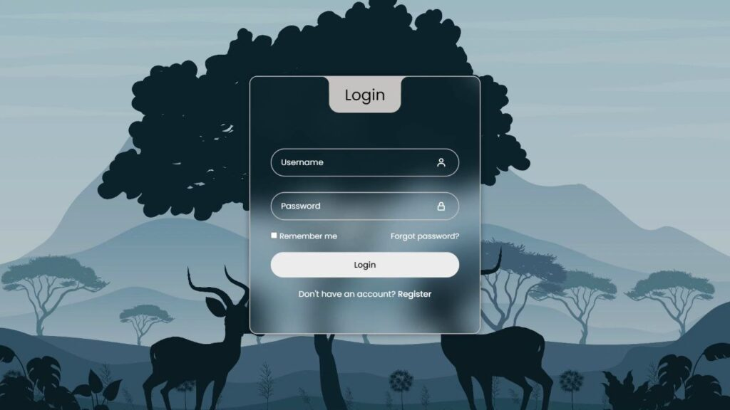
✨ What We’re Building
- Username and password input fields
- Floating labels for a modern user experience
- Icons using Boxicons
- “Remember me” checkbox
- “Forgot password” link
- Login button
- Register link
- Glassmorphism effect using blur and transparency
- Fully responsive design
🧱 HTML Structure
The HTML provides the structure of our login form. It includes semantic elements,
input fields, icons, and links, all wrapped inside a clean container.
We also use the Poppins font for modern typography and
Boxicons for clean, lightweight icons.
<!DOCTYPE html>
<html lang="en">
<head>
  <meta charset="UTF-8">
  <title>Modern Login Form</title>

  <link rel="stylesheet" href="https://unpkg.com/boxicons@2.1.4/css/boxicons.min.css">
  <link rel="stylesheet" href="https://fonts.googleapis.com/css2?family=Poppins&display=swap">
  <link rel="stylesheet" href="style.css">
</head>

<body>
  <div class="wrapper">
    <div class="login_box">

      <div class="login-header">
        <span>Login</span>
      </div>

      <div class="input_box">
        <input type="text" class="input-field" required>
        <label class="label">Username</label>
        <i class="bx bx-user icon"></i>
      </div>

      <div class="input_box">
        <input type="password" class="input-field" required>
        <label class="label">Password</label>
        <i class="bx bx-lock-alt icon"></i>
      </div>

      <div class="remember-forgot">
        <label><input type="checkbox"> Remember me</label>
        <a href="#">Forgot password?</a>
      </div>

      <input type="submit" class="input-submit" value="Login">

      <div class="register">
        Don’t have an account? <a href="#">Register</a>
      </div>

    </div>
  </div>
</body>
</html>
🎨 CSS Styling (Glassmorphism Effect)
The Glassmorphism effect is achieved using a combination of
backdrop-filter blur, transparency, borders, and subtle shadows.
This gives the login form a frosted glass appearance.
Key styling highlights:
- Backdrop blur for glass effect
- Transparent background layers
- Floating label animation
- Soft borders and shadows
- Responsive layout for mobile devices
* {
  margin: 0;
  padding: 0;
  box-sizing: border-box;
  font-family: "Poppins", sans-serif;
}

:root {
  --primary-color: #c6c3c3;
  --second-color: #ffffff;
  --black-color: #000000;
}

body {
  background-image: url("https://drive.google.com/uc?export=view&id=1uCohtd5e8ZjrZrhykzct1o1DAE9JNVfS");
  background-position: center;
  background-size: cover;
  background-repeat: no-repeat;
  background-attachment: fixed;
}

a {
  text-decoration: none;
  color: var(--second-color);
}

a:hover {
  text-decoration: underline;
}

.wrapper {
  width: 100%;
  display: flex;
  justify-content: center;
  align-items: center;
  min-height: 100vh;
  background-color: rgba(0, 0, 0, 0.2);
}

.login_box {
  position: relative;
  width: 450px;
  backdrop-filter: blur(25px);
  border: 2px solid var(--primary-color);
  border-radius: 15px;
  padding: 7.5em 2.5em 4em 2.5em;
  color: var(--second-color);
  box-shadow: 0px 0px 10px 2px rgba(0, 0, 0, 0.2);
}

.login-header {
  position: absolute;
  top: 0;
  left: 50%;
  transform: translateX(-50%);
  display: flex;
  align-items: center;
  justify-content: center;
  background-color: var(--primary-color);
  width: 140px;
  height: 70px;
  border-radius: 0 0 20px 20px;
}

.login-header span {
  font-size: 30px;
  color: var(--black-color);
}

.login-header::before {
  content: "";
  position: absolute;
  top: 0;
  left: -30px;
  width: 30px;
  height: 30px;
  border-top-right-radius: 50%;
  background: transparent;
  box-shadow: 15px 0 0 0 var(--primary-color);
}

.login-header::after {
  content: "";
  position: absolute;
  top: 0;
  right: -30px;
  width: 30px;
  height: 30px;
  border-top-left-radius: 50%;
  background: transparent;
  box-shadow: -15px 0 0 0 var(--primary-color); /* Removed space before --primary-color */
}

.input_box {
  position: relative;
  display: flex;
  flex-direction: column;
  margin: 20px 0;
}

.input-field {
  width: 100%;
  height: 55px;
  font-size: 16px;
  background: transparent;
  color: var(--second-color);
  padding-inline: 20px 50px;
  border: 2px solid var(--primary-color);
  border-radius: 30px;
  outline: none;
}

#user {
  margin-bottom: 10px;
}

.label {
  position: absolute;
  top: 15px;
  left: 20px;
  transition: 0.2s;
}

.input-field:focus ~ .label,
.input-field:valid .label {
  /* Added missing closing brace here */
  position: absolute;
  top: -10px;
  left: 20px;
  font-size: 14px;
  background-color: var(--primary-color);
  border-radius: 30px;
  color: var(--black-color);
  padding: 0 10px;
} /* Closed the missing brace */

.icon {
  position: absolute;
  top: 18px;
  right: 25px;
  font-size: 20px;
}

.remember-forgot {
  display: flex;
  justify-content: space-between;
  font-size: 15px;
}

.input-submit {
  width: 100%;
  height: 50px;
  background: #ececec;
  font-size: 16px;
  font-weight: 500;
  border: none;
  border-radius: 30px;
  cursor: pointer;
  transition: 0.3s;
}

.input-submit:hover {
  background: var(--second-color);
}

.register {
  text-align: center;
}

.register a {
  font-weight: 500;
}

@media only screen and (max-width: 564px) {
  .wrapper {
    padding: 20px;
  }

  .login_box {
    padding: 7.5em 1.5em 4em 1.5em;
  }
}
🎯 Final Thoughts
And there you have it 🎉 In just a few simple steps, we’ve built a
modern Glassmorphism-inspired login form using only HTML and CSS.
This design works perfectly for authentication pages, dashboards,
personal projects, or portfolio UI demos.
Feel free to customize the colors, fonts, or layout to match your brand.
If you face any issues or want to experiment further, you can always
download the complete source code and start tweaking right away.
Happy coding 💻✨ Keep building awesome things!
Keep it